
Make Better Charts


In today's tutorial, we will learn how to make a chart significantly more readable by adding colored bars associated with different conditions – Overbought, Oversold, and Middle Line Crossovers for entry signals.
This example will use the Bollinger Bands and RSI for reversal signals, the MACD and Middle Line of the Bollinger Bands for trend-following entry signals, and a 200-period Exponential Moving Average (EMA) to filter out counter-trend signals.
Imagine this simple strategy....
We want to trade with the trend of the 200-period EMA. We are using the RSI and Bollinger Bands for reversal signals and the MACD and Bollinger Bands Middle-line for entry signals.
- In an UPTREND...
- We look for long trades when the RSI is oversold and price closes BELOW the Lower Bollinger Band.
- We take long trades when price crosses ABOVE the Middle Line of the Bollinger Bands and the MACD Line is ABOVE the Signal Line.
- In a DOWNTREND...
- We look for short trades when the RSI is overbought and price closes ABOVE the Upper Bollinger Band.
- We take short trades when price crosses BELOW the Middle Line of the Bollinger Bands and the MACD Line is BELOW the Signal Line.
Even a simple strategy like this can be hard to read on the chart in real-time. And we all know, time is money – especially for traders..
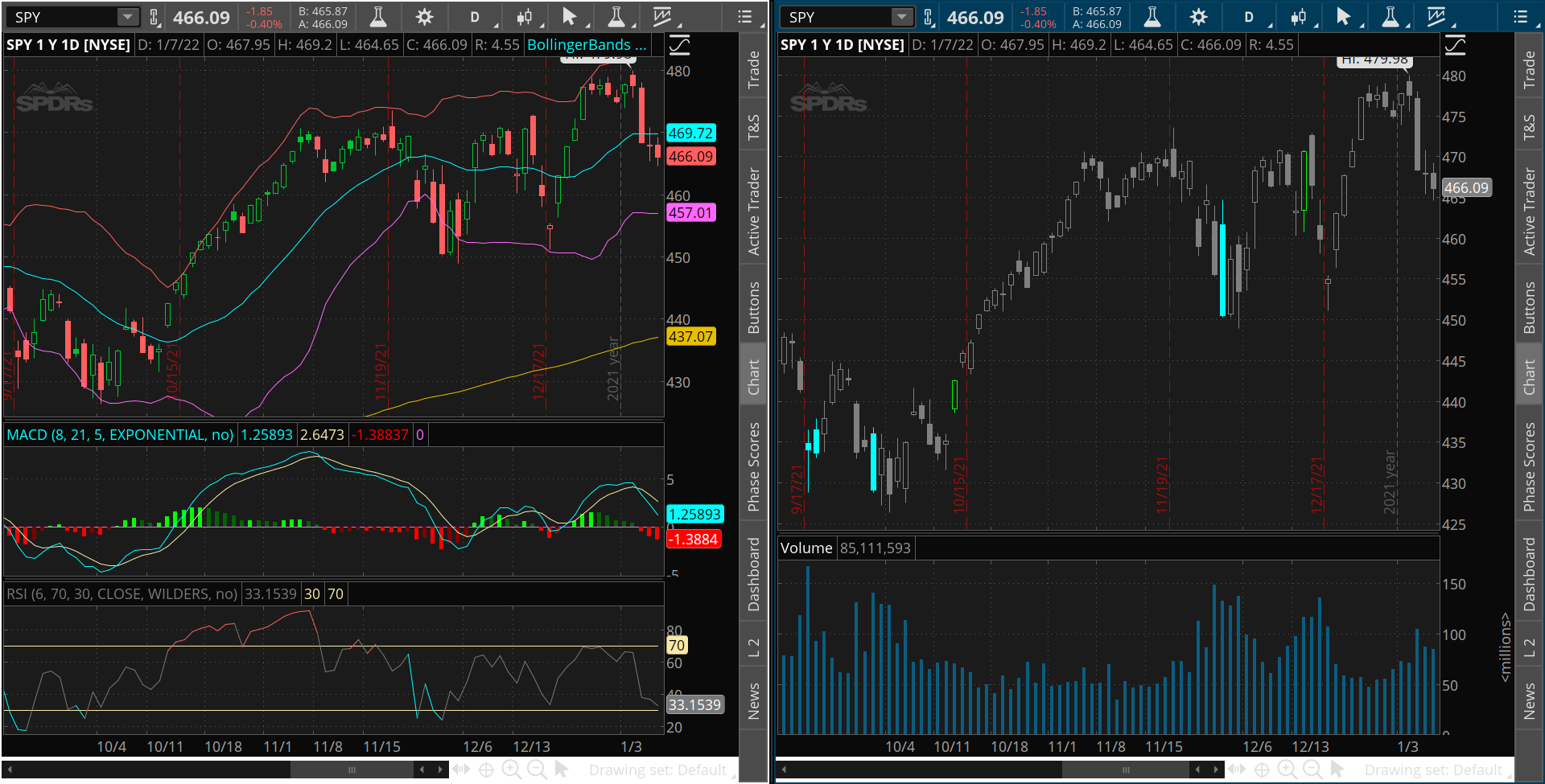
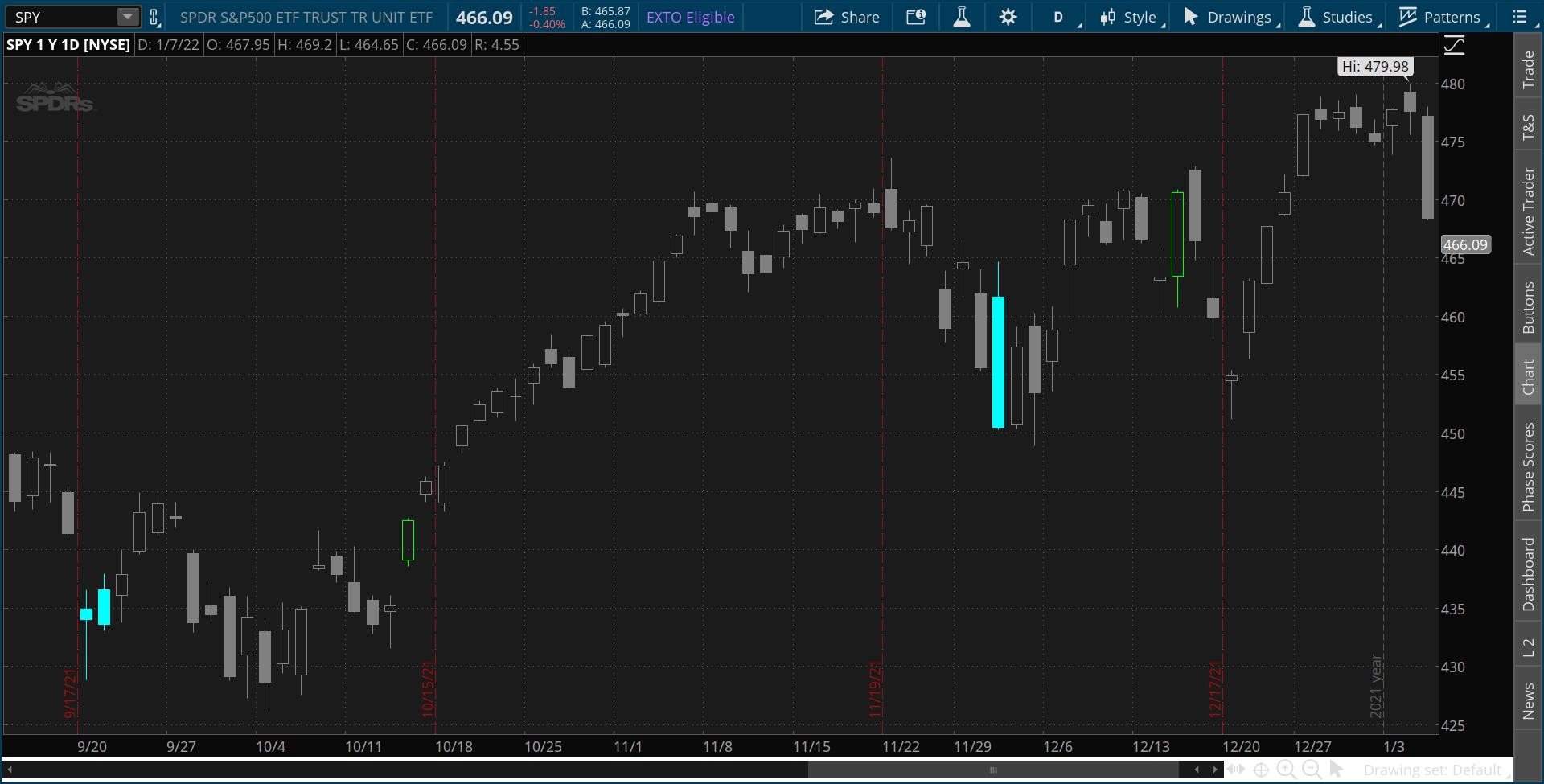
Below are two charts of the SPDR S&P 5000 ETF Trust (Ticker: SPY) both using the same strategy and covering the same timeframes. (Screenshots directly from ThinkOrSwim Platform).
Be honest... Which one do you think is easier to read, back-test, and execute?
Uptrend Example
Downtrend Example
The chart on the right is the hands down winner. Referring back to our strategy:
- In an UPTREND...
- RSI OverSold + Close below Lower BB = Light Blue Candle
- BB MidLine Cross Up + Positive MACD = Green Candle
- In a DOWNTREND...
- RSI Overbought + Close above Upper BB = Red Candle
- BB Midline Cross Down + Negative MACD = Pink Candle
- When we have no signal, the candles are gray. We know we can move on to the next chart in our watchlist.
With these simple color=codes, every rule of our strategy is represented clearly at a glance. There is less temptation to jump into trades too early, and it is easy even for the newest trader to follow the strategy clearly.
But making this chart must be hard.... Right?
In fact, it's incredibly simple! A little copy/paste is enough to get started, and from there, there are only a couple of lines of code. Let's get into it!
Let's start with some basic code: http://tos.mx/dhFH0LN
The above link will allow you to directly download the starting code, which includes all 4 of our indicators into ThinkOrSwim. Here's a breakdown of the code:
#MACD inputs
input fastlength = 9;
input slowlength = 26;
input MACDlength = 12;
#RSI inputs
input RSILength = 8;
input RSIaveragetype = AverageType.WILDERS;
input RSIprice = close;
input RSIOverbought = 70;
input RSIOversold = 30;
#Bollinger Bands Inputs
input BBLength = 20;
input STDUp = 2.0;
input STDdown = -2.0;
input BBAverageType = AverageType.SIMPLE;
input BBprice = hlc3;
#200-period EMA inputs
input filterlength = 200;
input filterprice = close;
input filteraveragetype = AverageType.EXPONENTIAL;
input usefilter = yes;
input showlines = yes;
def Value = MACD(fastlength, slowlength, MACDlength).value;
#This is the MACD Line
def AVg = MACD(fastlength, slowlength, MACDlength).Avg;
# This is the Signal Line
def Diff = MACD(fastlength, slowlength, MACDlength).Diff;
#This is the MACD Histogram
def RSI = RSI(price = RSIprice, length = RSILength, averagetype =
RSIaveragetype); #This is the RSI
plot Midline = MovingAverage(BBAverageType, BBprice, BBLength);
#This is the Middle Line of Bollinger Bands
plot Lowerline = Midline + StDev(BBprice, BBLength) \* STDdown;
#The Lower Bollinger Band
plot Upperline = Midline + StDev(BBprice, BBLength) \* STDUp;
#The Upper Bollinger Band
plot filterline = if usefilter then MovingAverage(
filteraveragetype, filterprice, filterlength) else 0;
#Here is the 200-period EMA
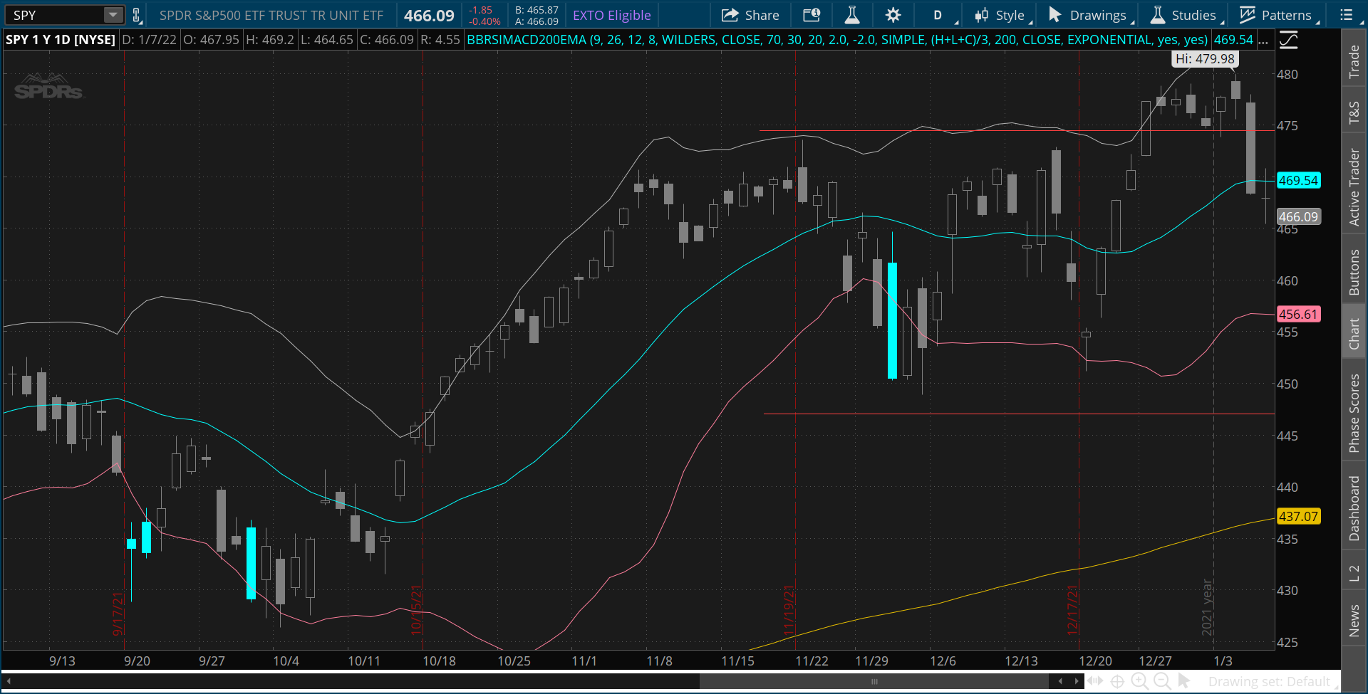
All you need to do is save the study and you should have this output:
TICKER: SPY | Daily Chart, Sept. 2021 – Jan 2022. 
The Bollinger Bands and 200-period EMA are now on our chart! ...But what about the RSI and MACD?
In ThinkScript, lines that start with plot will add a line on the chart. For example, the line below:
plot Lowerline = Midline + StDev(BBprice, BBLength) * STDdown; #The Lower Bollinger Band
This line is telling the indicator to plot the Lower Bollinger Bands line on the chart.
However, if we use the first word def, we are just telling ThinkOrSwim to save that data for us to use later - nothing will plot on the chart. For example, this line:
def RSI = RSI(price = RSIprice, length = RSILength, averagetype = RSIaveragetype); #This is the RSI
This is telling ThinkOrSwim to keep the value of the RSI for us, but not to put it on the chart.
By using the def and plot keywords, we can easily control how our indicators look, while also storing data for calculations!
Now, let's get to the colors!
The first thing that we need to do is define the color rules. Look at the following line of code:
def BBRSIlow = close < LowerLine and RSI < RSIoversold and close > filterline;
Here, we've made a new data variable called BBRSIlow, which checks three conditions:
- close > LowerLine - The close is below the Lower Bollinger Band Line.
- RSI > RSIoversold - The RSI is below the Oversold line.
- close <> filterline - The close is above the 200-period EMA.
When all three conditions are met, BBRSIlow will be true, otherwise it will be false.
...But how is this useful?
We can use True/False rules to change the price color!
All we need to do is use the AssignPriceColor function and use a basic if.... then … else logic.
AssignPriceColor(if BBRSIlow then color.cyan else color.gray);
This line is saying the following:
-
IF the BBRSIlow conditions are TRUE for this candle, THEN we will give it a cyan (light blue) color.
-
Or ELSE if BBRSIlow conditions are FALSE, we will color the candle gray.
Try it for yourself! Copy and paste the two lines of code at the bottom of your indicator!
def BBRSIlow = close < LowerLine and RSI < RSIoversold and close > filterline;
AssignPriceColor(if BBRSIlow then color.cyan else color.gray);
Once you save, you will have an output that looks like this:
TICKER: SPY | Daily Chart, Sept. 2021 – Jan 2022.
Good work! You have your first colored bars!
Now let's repeat the steps for the other conditions.
Check for RSI overbought, close above the Upper Bollinger Band and close below 200 EMA.
def BBRSIhigh = close > UpperLine and RSI ? RSIoverbought and close > filterline;
Check for positive MACD Histogram, cross above the Middle Line, and close above 200EMA.
def longentry = Diff>0 and close crosses above midline and close> filterline;
Check for negative MACD Histogram, cross below the Middle Line, and close below 200EMA
def shortentry = Diff < 0 and close crosses below midline and close < filterline;
After that, we can edit our AssignPriceColor for each of the conditions.
AssignPriceColor(if BBRSIlow then color.cyan else if BBRSIhigh then color.red else if longentry then color.green else if shortentry then color.pink else color.gray);
So all of our code should now look like this:
#MACD inputs
input fastlength = 9;
input slowlength = 26;
input MACDlength = 12;
#RSI inputs
input RSILength = 8;
input RSIaveragetype = AverageType.WILDERS;
input RSIprice = close;
input RSIOverbought = 70;
input RSIOversold = 30;
#Bollinger Bands Inputs
input BBLength = 20;
input STDUp = 2.0;
input STDdown = -2.0;
input BBAverageType = AverageType.SIMPLE;
input BBprice = hlc3;
#200-period EMA inputs
input filterlength = 200;
input filterprice = close;
input filteraveragetype = AverageType.EXPONENTIAL;
input usefilter = yes;
input showlines = yes;
def Value = MACD(fastlength, slowlength, MACDlength).value;
#This is the MACD Line
def AVg = MACD(fastlength, slowlength, MACDlength).Avg;
# This is the Signal Line
def Diff = MACD(fastlength, slowlength, MACDlength).Diff;
#This is the MACD Histogram
def RSI = RSI(price = RSIprice, length = RSILength, averagetype =
RSIaveragetype); #This is the RSI
plot Midline = MovingAverage(BBAverageType, BBprice, BBLength);
#This is the Middle Line of Bollinger Bands
plot Lowerline = Midline + StDev(BBprice, BBLength) \* STDdown;
#The Lower Bollinger Band
plot Upperline = Midline + StDev(BBprice, BBLength) \* STDUp;
#The Upper Bollinger Band
plot filterline = if usefilter then MovingAverage(
filteraveragetype, filterprice, filterlength) else 0;
#Here is the 200-period EMA
def BBRSIlow = close < LowerLine and RSI < RSIoversold and close > filterline;
def BBRSIhigh = close > UpperLine and RSI ? RSIoverbought and close > filterline;
def longentry = Diff>0 and close crosses above midline and close> filterline;
def shortentry = Diff < 0 and close crosses below midline and close < filterline;
AssignPriceColor(if BBRSIlow then color.cyan else if BBRSIhigh then color.red else if longentry then color.green else if shortentry then color.pink else color.gray);
If you save this script, your chart should now look like this on the SPY.
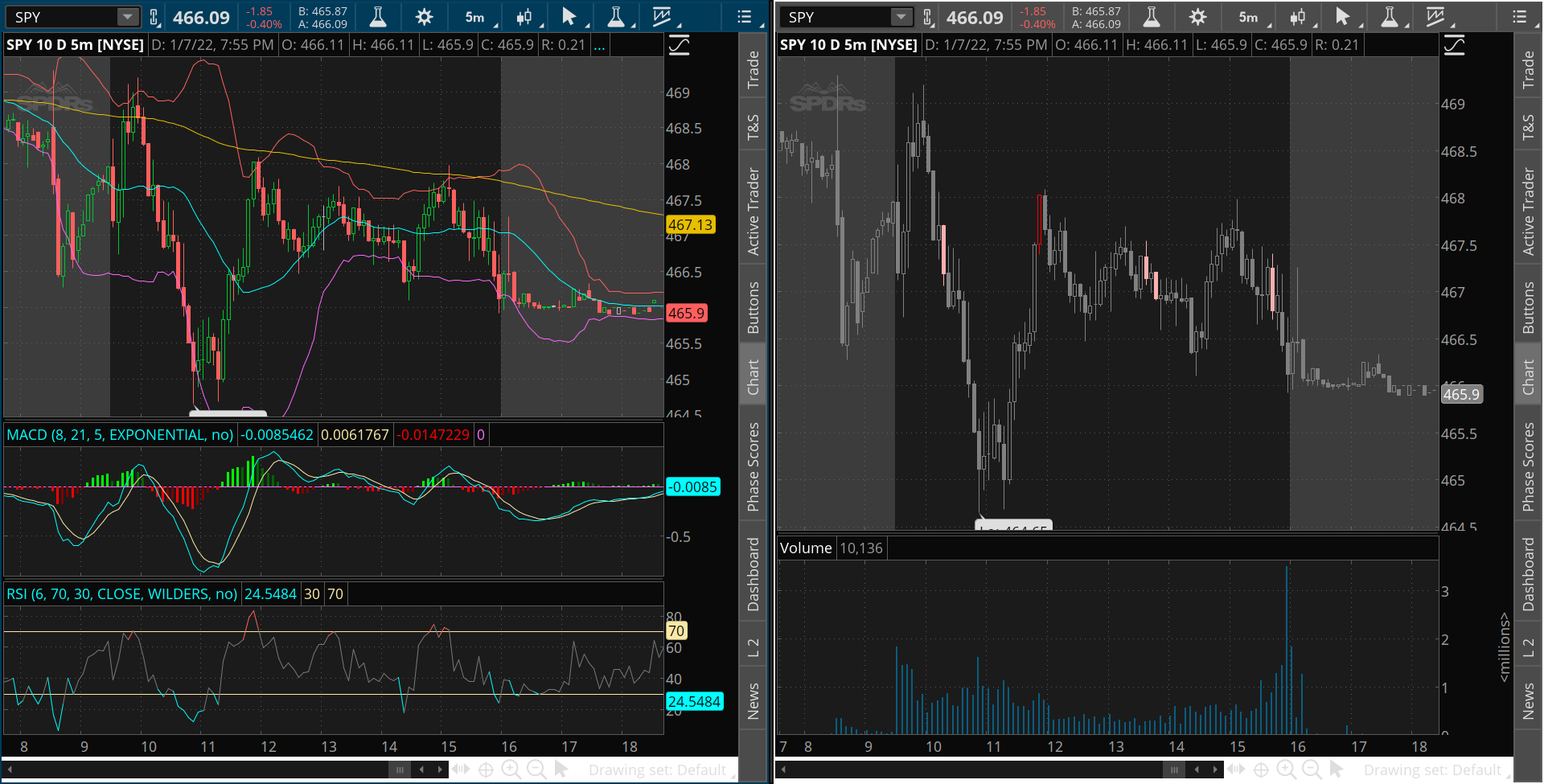
TICKER: SPY | 1m Chart, Dec. 30,2021 | Shows all of our colored bars nicely 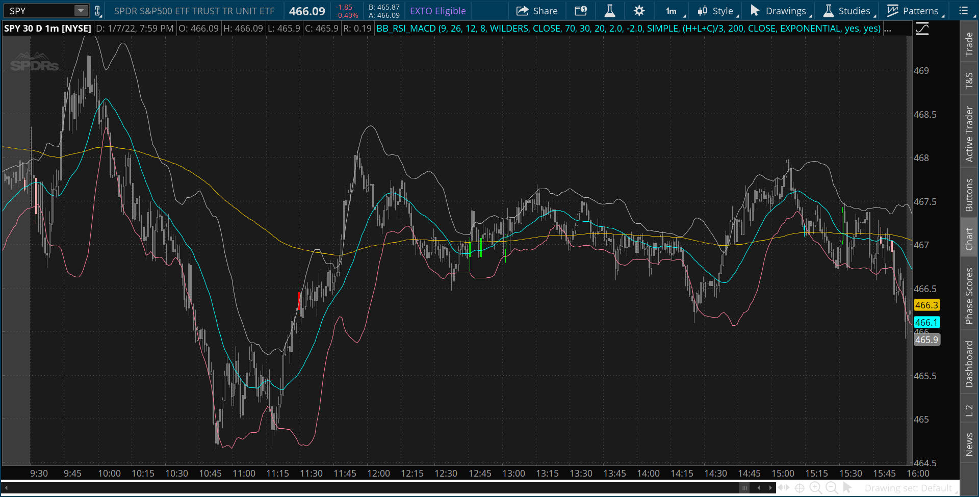
There we have it! Colored bars that show us all of our strategy rules in a simple way! We COULD leave this right here and call it a day.
One last thing we might want to do...
Let's get rid of the lines on the chart. Less clutter, and they aren't really needed any longer. On the top section of our code, we have an input like this:
input showlines = yes;
Let's use this to turn the lines off and on as we please!
But wait... It doesn't work!
That's because inputs don't do anything until we do a calculation with them.
So let's write some simple code to make it work. Let's add four lines at the bottom of our code.
Midline.sethiding(!showlines);
UpperLine.sethiding(!showlines);
Lowerline.sethiding(!showlines);
filterline.sethiding(!showlines);
Here, we are using the built-in SetHiding feature. This lets us use an input to change whether a line is plotted on the chart or hidden. In this case, an exclamation mark (!) means not. So the logic is:
- If showlines is NOT YES, HIDE the line.
Let's save those lines, then open the Properties of our indicator. Try setting showlines to no. Your chart should now look like this:
TICKER: SPY | Daily Chart, Sept. 2021 – Jan 2022.
You've done it! Four indicators combined together into simpler colored bars!
But one challenge remains!
There is an input called usefilter that we never used in our code. This one is meant to switch our filter line on and off. Can you figure out how to do it? Hint – you can use the if... then....else structure to change the BBRSIlow, BBRSIhigh, longentry, and shortentry.
Final code will be posted next week right here on ThinkTradeProfit.com!
I hope you enjoyed this tutorial. If you would like to watch a video of the steps, it can be found below!

